Pages

  • twitter
  • facebook
  • rss
Showing posts with label typography. Show all posts

Beautiful Things (v 3.0)

One of this week’s projects was to make a different version of my “beautiful things” sign.  My first ever made a brief appearance at a vintage market last summer, and I was always a little sad that it sold!

bellas 024

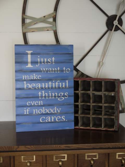
The next version (on beadboard) was made for a market this summer…

I Just Want to Make Beautiful Things... 15 x 20 beadboard

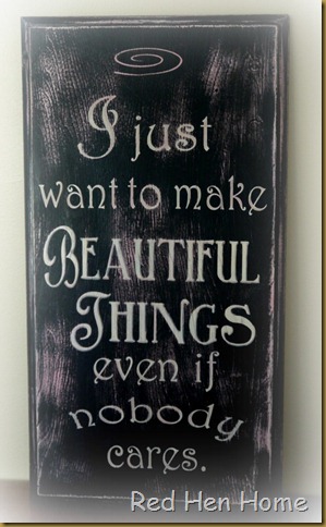
…but my buyer wanted something more along the lines of my Bread & Pastries sign. 

beautiful things cupboard door sign

We had quite the debate over pink-and-white, pink-and-black, or black-and white…so we decided to use all three colors instead of choosing!  The lettering is off-white, but the cupboard door was painted pink underneath the black, so it shows through with heavy distressing.  Plus, there’s a pink swirl at the top just for fun!

beautiful things cupboard door sign

I just love the sentiment, don’t you??

***********************************************
Linking up here:
Domestically Speaking Elizabeth & Co.
  The CSI Project
Friday Remodelaholic 2805
My Simple Home Life’s Simple Creations Friday  
Funky Junk’s Saturday Night Special The DIY Show Off
Beyond the Picket Fence Someday Crafts
Knick of Time
Mod Vintage Life
My Uncommon Slice of Suburbia
Perfectly Imperfect {Primp}
Common Ground My Repurposed Life
From My Front Porch to Yours All Star Block Party
Cowgirl Up! {aka} design
Coastal Charm
[ Read More ]

French Postcard Table

I haven’t really fallen off the planet, I promise.  I just seem to have come down with a serious case of blog ennui

I don’t think it’s terminal.

All my kids are back in school this week, and the weather seems to be cooling down a little bit.  So the urge to work on some furniture has finally hit, and that’s a good thing (I have quite a stash accumulated).  One of this week’s projects was this coffee table:

postcard table

It started out like this:

postcard table 004

I doubt you can tell from the picture, but the finish on the top is almost completely gone.  What did someone do to that table, I wonder??  Not that I care, really, because it makes refinishing it much easier!

I went through my stash of French typography (mainly courtesy of the Graphics Fairy), and decided this table wanted to look like a vintage French postcard (similar to—but not exactly like—my white postcard table I painted last summer).

postcard table

There have been a LOT of typography tables since my first French Chocolate table, so it’s a challenge to change things up enough not to be boring!  So for this table, I played around with a little color.  Although the address is in black, the note that crosses the top corner is actually in a dark charcoal to differentiate it.

postcard table 020

But my favorite is the postmark in my favorite color…RED!

postcard table 013bThe base of the table got a good scrubbing and refreshed with a little oil-rubbed bronze paint.   Doesn’t it have a pretty shape? 

postcard table 017

So there you have it.  I’m still kicking and still painting  ;-)

Happy Fall, ya’ll!

This project has been featured at the Graphics Fairy, Elizabeth & Co., From My Front Porch to Yours, and aka design.

***********************************************
Linking up here:
Domestically Speaking Elizabeth & Co.
Primitive & Proper The CSI Project
Friday Remodelaholic 2805
My Simple Home Life’s Simple Creations Friday Miss Mustard Seed’s Furniture Feature Friday
Funky Junk’s Saturday Night Special The DIY Show Off
Beyond the Picket Fence Thrifty Décor Chick
Knick of Time
Mod Vintage Life
My Uncommon Slice of Suburbia
Perfectly Imperfect {Primp}
Common Ground My Repurposed Life
From My Front Porch to Yours All Star Block Party
Cowgirl Up!
The Graphics Fairy
{aka} design
Coastal Charm
[ Read More ]

Patisserie Coffee Table

I have been working like crazy to finish projects for the Whitaker Flea Market this Saturday—I haven’t even had time to read my favorite blogs (now that’s busy)!

But I thought I’d pop in and show you one of the projects that will be going with me.  A neighbor of mine was cleaning out her garage, and would you believe she was going to take this table to Deseret Industries (that’s Utah’s Goodwill)??

OK, so I forgot to take a real “before” picture…but here’s the top, being sanded my my handy-dandy-helper-who-wants-to-earn-money-for-a-new-game…

boards 018

…and here’s the base (which is actually a dark green color).

boards 019

I decided to make another coffee table along the lines of the French chocolate coffee table, so I chose a graphic and pulled out my overhead projector:

patisserie table 007

…working on it…

patisserie table 008

…done!

patisserie table 010

The next day I distressed the lettering and gave the table top a coat of antique walnut stain.  I sanded back the stain in places, since I didn’t want it to look too perfect—it’s supposed to look like an old crate, after all!

flea market 016

I painted the base in a creamy white, and glazed it with antique walnut stain.  This table has LOTS of distressing, and the glaze makes it look “on purpose” rather than “beat up.”

flea market 017

This coffee table is HUGE:  40” x 50”.  Perfect for games, puzzles, or pizza!

flea market 019

I really enjoyed doing another graphic project like this…it has been too long!

flea market 021

This table has been featured at aka design.

******************************************

Linking up here:

 Domestically Speaking Elizabeth & Co.
Sisters of the Wild West The CSI Project
Friday Remodelaholic 2805
My Simple Home Life’s Simple Creations Friday Miss Mustard Seed’s Furniture Feature Friday
Funky Junk’s Saturday Night Special The DIY Show Off
Beyond the Picket Fence Primitive & Proper
Knick of Time My Uncommon Slice of Suburbia
Perfectly Imperfect Thrifty Décor Chick
Simply Klassic Sundays My Repurposed Life
From My Front Porch to Yours It’s So Very Cheri
Cowgirl Up! {aka} design
[ Read More ]

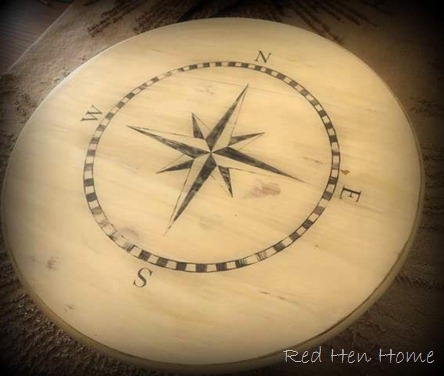
Compass Coffee Table

Oh, coffee tables…how I have missed you…

compass 007

After my coffee-table-painting-spree last spring (all beginning with the French Chocolate table), there has been a dearth of coffee tables in my life.

It’s been very sad.

OK, that’s not really the truth.  The truth is that this particular coffee table has been sitting around half-finished in my garage for months.  But my post-Christmas don’t-know-what-to-do-with-myself-itis finally made me get it done!

I fell in love with Vintage Revival’s painted compass rug back in…let’s see, I think it was May—and promptly saved it to my “bookmarks.”  (See, it was so long ago, it was pre-Pinterest!)

image

I thought the compass idea would be great for a table, so I went on the hunt for a round coffee table and found this one:

selling 006

After sanding, I base-coated it white, but then I dry-brushed two or three (I can’t really remember anymore) other shades of white and cream onto it to give the color a little depth.

January 007

Then it sat…and sat…and sat…in my garage.  It got dusty and dirty; it got paint remover spilled on it…it got circles of stain from the stain can on it…

I call it “character–building.”

Finally this week I decided to just GITTER-DONE (ala Funky Junk)!  After touching up the paint, I generally followed Mandi’s tutorial, and with the aid of a yardstick and a 45-degree triangle, I drew my compass with a pencil.  (I also did a Google search for “how to find the center of a circle,” because I no longer remember.  I used the instructions here.)

Guess what?  You can erase pencil marks off of paint pretty good.  Thank heavens.

January 008

I painted the compass design with plain old acrylic paint, while crawling around on the floor next to the table.  My knees are still sore. 

I don’t really have too many intermediate pictures…sorry; my kids have to go to school sometimes…so let’s just jump in to the “after,” OK?

compass 004

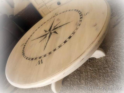
The distressed the table pretty heavily, going down to the wood in places, but also showing off the layers of “white.” 

compass 013

I glazed the whole thing with Jacobean stain mixed with Martha Stewart glazing medium.

compass 010

I really, really love it!

compass 002

Hmmm…maybe I should try this on a rug!

compass 006

******************************************

This project has been featured at It’s So Very Cheri, Better After, Stylish Once Again, Elizabeth & Co., Bless My Nest, and…

*********************************************

Linking up here:

Coastal Charm’s Nifty Thrifty Tuesday Elizabeth & Co.
Domestically Speaking’s Power of Paint Stylish Once Again
Hookin’ Up with House of Hepworths No Minimalist Here’s Open House Thursday
Friday Remodelaholic 2805
My Simple Home Life’s Simple Creations Friday Miss Mustard Seed’s Furniture Feature Friday
Funky Junk’s Saturday Night Special The DIY Show Off
Primitive & Proper Thrifty Décor Chick
Beyond the Picket Fence’s Under $100 Party My Uncommon Slice of Suburbia
Perfectly Imperfect {Primp}
Mod Vintage Life My Repurposed Life
Too Much Time on My Hands It’s So Very Cheri
Common Ground Artsy Girl Connection
[ Read More ]

French Bench

I’ve been trying to organize my picture files, which I find almost as exciting as organizing my sock drawer. However, one good thing came out of it (and it wasn’t finding my matching blue-striped fuzzy socks, although I really would like to) – I came across one of my summer projects that never got to be posted!  Poor thing.

Anyway, based on my French chocolate coffee table (which spawned a few more similar projects  here, here, and here), I decided to transform this old bench…

kidpics 003

…into a ‘vintage French’ piece!

My original idea was just to sand the top down to bare wood, and paint the base of the bench.

kidpics 004

But do you see those wide panels that run along the front and the back? The bench told me (if you have read my blog, you’ll know that furniture often talks to me) that those spaces were perfect for more typography. So before I knew it (not really—it took forever) I had sanded the entire bench down!

kidpics 005

I only worried about removing the old finish. All the knicks, scrapes, and dings are welcome to stick around.  That’s character.

Next thing was to choose the perfect graphic (all of my French ads have been found at The Graphics Fairy), print it out, and then take it to an office store to be copied onto an overhead transparency.

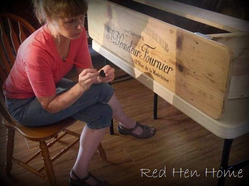
Here I am at work…

kidpics 008

If you’ve seen my other projects, you’ll notice that I’ve gotten a little smarter. I put this piece up on a folding table so I didn’t have to contort myself on the floor so much!!

And in case you’re wondering…I am using a plain old bottle of acrylic paint. (Others have suggested using paint markers or a Sharpie, but I don’t think they distress as well. You can use whatever suits you best.)

kidpics 012-1

I really dressed up for this impromptu photo shoot, can’t you tell?

kidpics 013

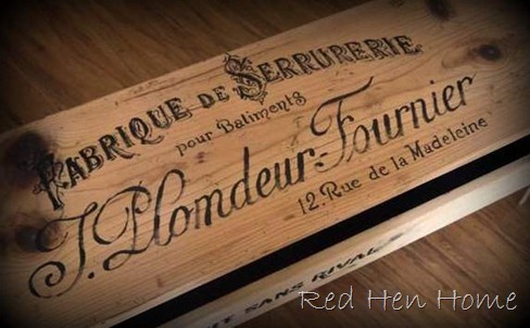
This is what the bench looks like before any distressing or staining.

kidpics 014

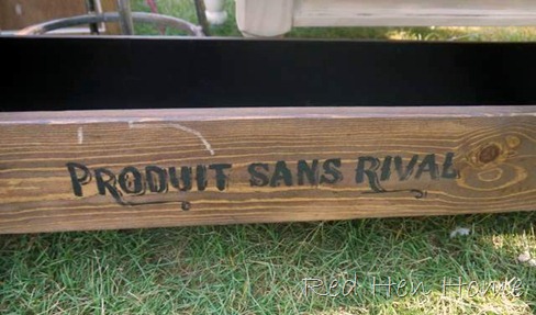
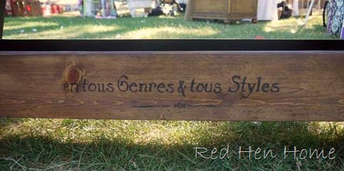
I actually used lines from two other ads for the front and back panels of the bench.

kidpics 015

They may or may not make sense with what the top says!

kidpics 016

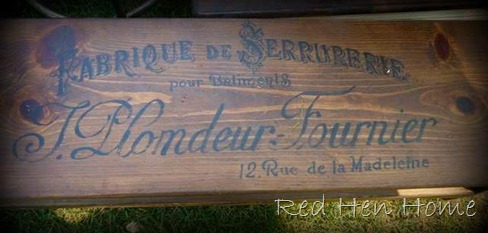
After the paint was completely dry, I distressed the lettering with sandpaper, and then wiped on a coat of Minwax Antique Walnut stain. I finished the bench with a couple of coats of Minwax Polycrylic.

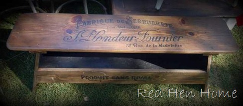
This little bench went with me to an outdoor market in July. It was one of the last projects I finished before going, so it missed out on a ‘formal’ photo shoot in my home! But here’s what it looked like outside on a beautiful July day.

bellas 001

bellas 002

You may not have noticed it, but those two side panels actually hide a lower cubby. I envision this as an entry bench with a place to hide shoes! (I painted the inside black.)

bellas 005

bellas 017

So that’s my little French Bench. If this looks like a project you would like to try, be sure and check around for a used overhead projector. Lots of times you can find them at school surplus sales, or you might even be able to borrow one from your local school.

bellas 016

Ahh, summer….

****************************************************************

Linking up to these great parties:
Coastal Charm’s Nifty Thrifty Tuesday Topsy Turvy Tuesdays
Domestically Speaking’s Power of Paint Someday Crafts’ Whatever Goes Wednesday
Hookin’ Up with House of Hepworths No Minimalist Here’s Open House Thursday
Friday Remodelaholic 2805
My Simple Home Life’s Simple Creations Friday Miss Mustard Seed’s Furniture Feature Friday
Funky Junk’s Saturday Night Special The DIY Show Off
Primitive & Proper I Heart Naptime
Beyond the Picket Fence’s Under $100 Party My Uncommon Slice of Suburbia
Perfectly Imperfect {Primp}
Mod Vintage Life Sisters of the Wild West
Thrifty Décor Chick One Month to Win It
The Graphics Fairy My Repurposed Life
[ Read More ]

Transparency Transfers

I’m a lot slower getting this posted than I had intended…sorry about that. But here I am now, with the BIG SECRET TRANSFER METHOD (no, not really) that I promised when I posted about my French Chocolate Bar Stools.

chocolate stools 001

I have had lots of fun transferring vintage French ads (courtesy of the Graphics Fairy) to various pieces of furniture, such as the French Chocolate table, Café table, the Postcard table, the Black Coffee table and French Twist table. I used an overhead projector for all of those, and I really love the look I was able to get.

However….

…I had to choose my graphics very carefully, as I am limited in the amount of detail I can recreate with my paint brush. Plus…I simply don’t have the patience to do anything really teeny tiny, so that’s why I focused on tables!

So I wanted a way to simply transfer images without necessarily having to break out the paint brush. I tried Mod Podge transfers (there’s a good explanation here), but I had mediocre results. I shelled out the money for Citra Solv, and had good results—some of the time (this method is explained here). So I got discouraged.

But…the Citra Solv transfer PLUS the overhead transparency method gave me a new(ish) idea.

When I wanted to use my overhead projector, I had to print my graphic out on paper and take it to a copy store to have the transparency made. Ink jet printers (which is what most homes have) deposit ink on the surface of a sheet, so it will smear off if you touch it. Laser printers/copiers do something like injecting the image into the sheet, so they are permanent. (Yeah, I’m just shooting from the hip for this explanation. Just go with me here.)

Citra Solv transfers work because the Citra Solv re-dissolves the ink on your page, allowing it to re-deposit onto your project. (The issues I had with Citra Solv is that it DID NOT always re-dissolve the ink—maybe some toner cartridges are getting better??)

so one day I had an “aha” moment—if I printed on a transparency sheet using my ink jet printer, the ink was already “dissolved.” So…could I just transfer an image without any special solvents?

Well, let’s see, shall we??

Here’s a Citra Solv transfer onto a painted surface.:

bday 065

…and an unpainted surface:

bday 067

Here’s an ink jet transfer onto a painted surface:

bday 066

…and an unpainted surface:

bday 068

Pretty hard to tell the difference, huh?

I was majorly excited after this little experiment.

bday 070

Like my cute little test board??

But then….I got stuck.

See, the real difference is that if you’re transferring from a laser copy, THAT ink is NON-water soluble (thus, you have to use the Citra Solv). If you’re transferring from an ink jet copy, that ink IS water soluble and it will continue to be so. If you wanted to wash your project at some point—the image would come off. If you try to use something like, say, Minwax Polycrylic (which is water-based) to protect your image—you’re going to end up with a big smeary mess which will cause you conclude that your grand idea is a huge failure and you might just hide your project board in the laundry room for the next four months.

Yep. Really.

But then one day (four months later) a new idea might finally occur to you—which you, being MUCH SMARTER than I am—probably already figured out!!

If you do an ink jet transfer, you have to use an oil-based protective coat.

That’s all there is to it. No water = no smeary ink!

For the stools, I used Minwax Hand-rubbed polyurethane, and I didn’t have any smearing problems. Such a simple solution, but seriously—it drove me nuts!!

Now, recently there have been some other projects in blog-land that have transferred ink-jet images using freezer paper. It’s the same principle, so you can use whatever substance you happen to have one hand (I promise I came up with this idea independently of those, and I have the dates on my pictures to prove it! Winking smile)

The two slight advantages that I see in using transparency sheets are these:

    1. After you’re done with your transfer, you can wash the ink residue off of the transparency, making it completely reusable.
    2. Since the sheets are—you know, transparent—you can more accurately place your image on your project.

So here’s a quick run-down of the steps I use for a “transparency transfer,” using a cool old bread board for my project.

1. Slightly dampen your project to facilitate the ink transfer. I generally wiped it with a damp cloth, and then waited a minute or two for it to be nearly dry.

transfer 006

2. Print a reverse image of your graphic (I copied my images into Microsoft Word. Click on the image, and a new tab called “Picture Tools” will appear at the top of the page. Click on the tab and then on the “Rotate” option, and “Flip Horizontal”) directly onto an overhead transparency (you can buy individual sheets from a copy center; no need for a whole box). Tape it in place.

transfer 009

3. Using the back of a spoon (I have also used a bench knife), rub the image ALL OVER and HARD to transfer as much ink as possible.

transfer 011

4. Voila! You have achieved image-transfer-nirvana. If you want to protect your image, let it dry fully and then give it a coat (or two) of a non-water-based polyurethane.

transfer 012

That was a very long-winded explanation, so congratulations if you haven’t completely lost interest yet (image transfer----whaaa?? who cares??)

What do you think? Is this something you might try? Or is it so simple as to be…stupid, and everyone already knew about it but ME??

Note: The super-slick surface of the bar stools did not “take” the transfer quite as well as the softer wood of the cutting board, so I used a black Sharpie to darken up the image in places.

**************************************************************

This project was featured at Craft Gossip and My Uncommon Slice of Suburbia.

****************************************************************

Linking up to these great parties:
Coastal Charm’s Nifty Thrifty Tuesday Topsy Turvy Tuesdays
Domestically Speaking’s Power of Paint Someday Crafts’ Whatever Goes Wednesday
Hookin’ Up with House of Hepworths No Minimalist Here’s Open House Thursday
Friday Remodelaholic 2805
My Simple Home Life’s Simple Creations Friday Miss Mustard Seed’s Furniture Feature Friday
Funky Junk’s Saturday Night Special The DIY Show Off
Primitive & Proper I Heart Naptime
Beyond the Picket Fence’s Under $100 Party My Uncommon Slice of Suburbia
Perfectly Imperfect {Primp}
Mod Vintage Life Redoux
Thrifty Décor Chick Stylish Once Again
The Graphics Fairy My Repurposed Life
[ Read More ]

Related Posts Plugin for WordPress, Blogger...